

We're rolling out a new logo, a new design system, and a new visual language across every platform today. Here's the thinking behind it.
Evolved identity for a bigger mission
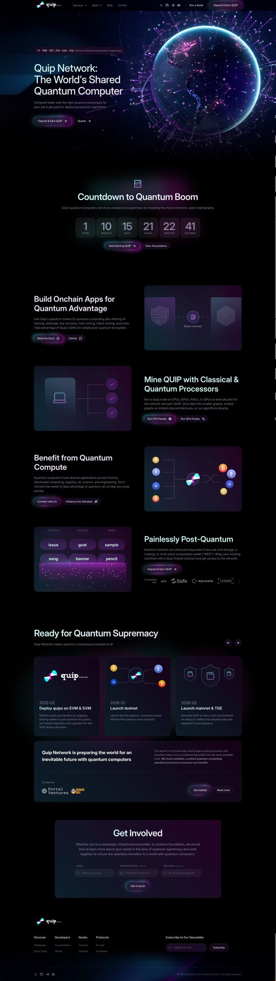
What started as a project focused on quantum-resistant wallets has expanded into something much larger: a worldwide quantum computer, with on-demand compute, cross-chain interoperability, and partnerships with hardware manufacturers. We outgrew our original brand, and we needed an identity that could speak clearly to the different communities building on and with the network.
We worked with Relate Studio to build the new brand and design system. Their portfolio includes some of the biggest names in Web3, including Sui, Jupiter, and Solana Foundation, and they brought that same level of craft to translating our vision into an identity scaled to where we're going.
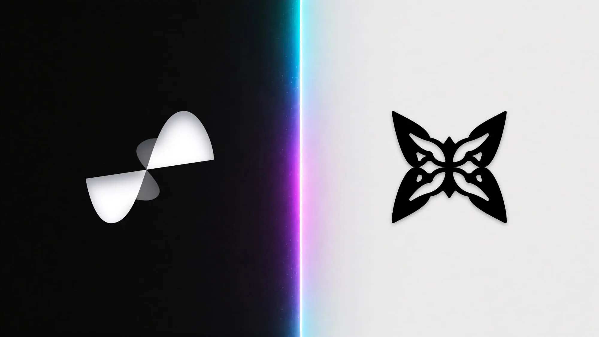
Two meanings in one mark
A butterfly is an organism that begins as one thing and becomes another, much like Quip Network itself. The choice of a butterfly as the central mark carries that idea of metamorphosis without needing to explain it.
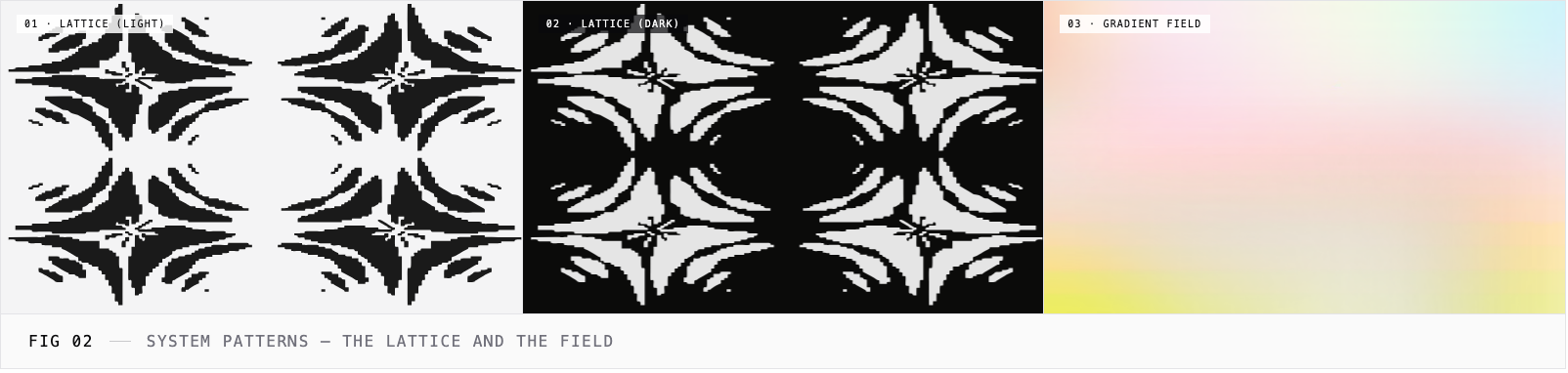
The mark also carries a specific reference from quantum physics. In 1976, a graduate student named Douglas Hofstadter plotted the energy spectrum of electrons moving through a two-dimensional lattice under a magnetic field. The math was known, but the output was not: a recursive, self-similar fractal shaped unmistakably like a butterfly. Every wing contained smaller copies of the whole, and every gap between energy bands revealed the same pattern at finer and finer scales.
Hofstadter published the result (Physical Review B, 1976) before Benoit Mandelbrot had even introduced the word "fractal" to English-language science.
In 2013, three independent research groups observed the butterfly experimentally in graphene. In 2017, a team at Google recovered the pattern using nine superconducting qubits.
Hofstadter's butterfly is the result of a lattice interacting with a field, where structure emerges from the relationship between individual nodes and the forces that connect them. That maps directly to what we're building: quantum processors around the world form a lattice, our consensus protocol acts as the organizing field, and the useful computation that emerges from their interaction produces patterns that no single node could generate alone.
Four wings, four audiences
The four wings of the butterfly mark correspond to the four communities Quip Network serves. Each one gets a glyph that shows up across the site and brand materials, plus a motif as its visual signature.
- Consumers (diamond) buy compute credits and run them on a quantum processor, paying spot rates for time on the network.
- Operators (node) run nodes on quantum processors, GPUs, CPUs, ASICs, and exotic hardware, and earn QUIP for the work their machines do.
- Enterprises (point) use the network's solvers for portfolio allocation, risk modeling, fleet routing, manufacturing scheduling, and similar workloads where quantum compute meaningfully outperforms classical approaches.
- Developers (pixel) write the algorithms, tune the nodes, and ship the protocol. The global pool of quantum researchers is small, and the network pays them every time their solver runs.
"We were one brand trying to talk to multiple audiences. The old identity worked for crypto-natives, but it wasn't going to work for the enterprise CTO or the consumer buying their first quantum compute credit. Our new design system gives each audience its own visual signature within one cohesive identity."
Brent Oshiro, Head of Marketing, Quip Network
What's next
The new look is live across quip.network and our social channels. Documentation, developer tools, and the interfaces where the network meets our users get the new look in the coming weeks.


